10 Hidden Messages In Well-Known Logos
Lists, WeirdEvery business or company needs a logo, as the images help to establish a specific brand and make their organization instantly recognizable to customers at a glance. This means that there are millions of different logos in the world, with a huge range of designs, though the ones belonging to the biggest brands are the most identifiable. Despite the fact that people will have seen some of these logos hundreds or thousands of times, many have hidden messages that are far from well known.
Baskin Robbins
Eagle eyed people may have noticed that the Baskin Robbins logo seems to have a stylized “31” incorporated into the design. This has been done because the company has 31 different types of ice cream flavors.
Goodwill
Not only does the Goodwill logo show of the name of the company and a face that seems to be smiling, helping to show off the good natured mission of the organization, but the face is also a lower case g to represent the first letter of the company’s name.
Eighty20
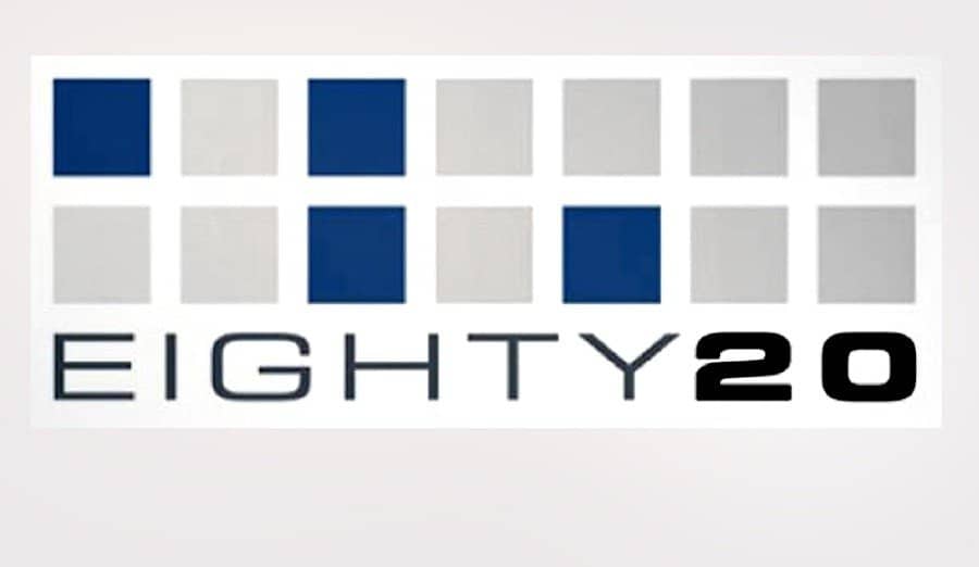
The colored boxes of the Eighty20 logo are not just a stylistic design that is meant to look good but is actually binary code that translates to 80 and 20.
Amazon

Although it is clear that the Amazon logo seems to be trying to make a smiling face with the graphic below their name, what many miss is the fact that the arrow is pointing from the letter a to the letter z, indicating that the shop stocks everything from A to Z.
Tostitos
Although it might seem obvious to some people, the Tostitos logo includes two people sharing food over a red salsa bowl.
Toblerone
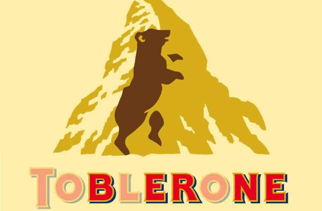
While the fact that the Toblerone logo is of a mountain, to show of the impressive mountain ranges that are present in Switzerland, there is also a bear that has been put into the design. This is because the chocolate comes from a town called Berne, which was known as the City of Bears.
IBM
The IBM logo is one of the simplest and most effective in the technology industry, though the white and blue stripes also contain a hidden equals sign in the bottom right corner, which signifies the equality that the company wishes to encompass.
BMW
The distinctive blue and silver design of the BMW logo was specially created to pay homage to the history of the company, which was heavily involved in aviation. The blue represents the sky while the silver is meant to be a spinning propeller from an airplane.
FedEx
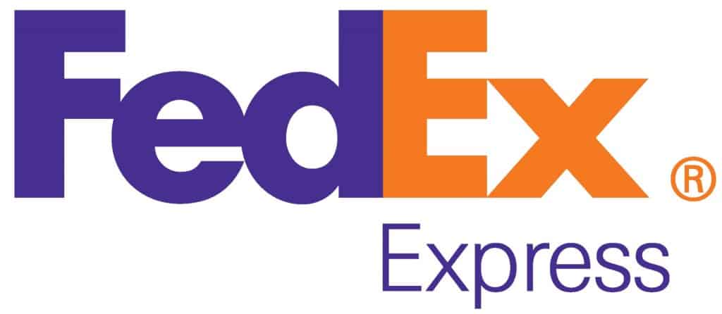
Hidden within the FedEx logo is a brilliant yet deceptively unassuming image that can’t be unseen once you are aware of it. In between the E and the X is an arrow, signifying the idea of movement.
Apple
The Apple logo is another example of a simple and elegant solution, though it may be puzzling why the company chose the name Apple at all. The image, which has a bite out of it, signifies the apple taken by Adam and Eve in the Garden of Eden, representing the idea of knowledge.


