20 Hilarious Advertisement Fails You Must See
Design, Funny, Lists, Other, Photography, Shocking, Social, WeirdAdvertisements are everywhere nowadays, on our phones, computers, billboards and television — just to name a few. Most adverts have been meticulously made to ensure they convey the correct message, appeal to their target audience, and use colors, slogans or catchy tunes to grab our attention. There are, however, plenty of advertisements which weren’t properly thought through — they may have been overlooked or completed in a rush. These advertisement failures are hilarious, so have a check through these twenty that we’ve selected, and have a laugh or two at their expense.
Star…sucks
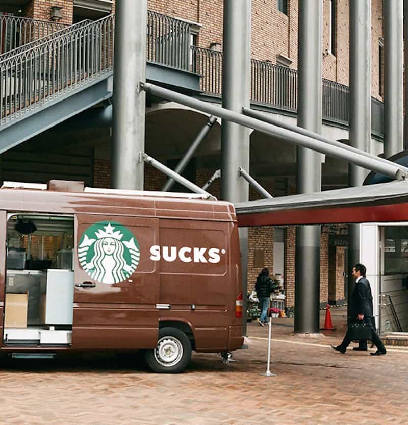
Advertisements on the side of vehicles is nothing new, however placing them on the side of a vehicle with a sliding door should cause the advertisers to look more closely at what they’re putting there. Case and point, this Starbucks advertisement; while it may seem fine when you’re driving around, once you open the door you company kind of… sucks?
Baby Products

While you go to the store to buy diapers or baby food, it appears as if this store knows what your baby needs most.
Pendennis

Just like the Starbucks advertisement, companies should really think through what they’re putting on the side of vehicles with sliding doors.
Go Ahead, Show Her

While we’re not too sure if those images of the women were purposely placed in these locations, the end result is hilarious regardless.
Time To Change Churches

If the church you attend has something like this in front of their graveyard, you may want to consider attending a different church.
Mmm… Fabulous?

The image, text and dirt on this advertisement make it hilarious. Firstly, the image of the woman in her underwear is in the perfect spot for all of that mud on your tires to fly off.
Nice… Tow Ball?

The placement of this ad right above the tow ball of the bus is hilarious, whether it was intended or not.
Sticker Placement

We’re not too sure whether the worker purposely put the sticker in this location, but the resulting message is inspirational.
Grab The Handle
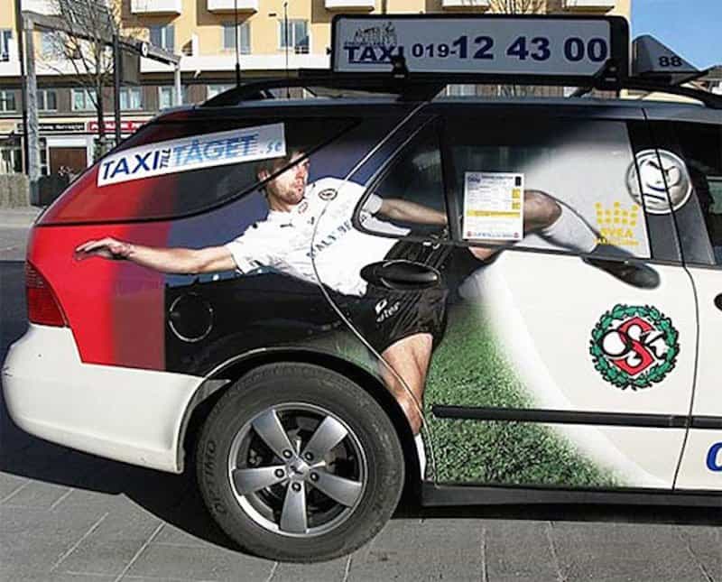
We were looking at this advert for a while, until we found out what was wrong with it. If you can’t find it, look where you’d open the back door.
Jesus Cat

This billboard placement is perfect. It appears as if Jesus was reincarnated into on of our furry feline companions.
Don’t Take It Literally
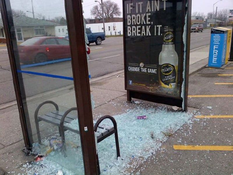
It seems as if this advert was taken literally, as the window which wasn’t previously broken, obviously is now. We’re just wondering whether the company who built the bus shelter could sue the advertisers.
Nice Hats

This has to be placed here on purpose. Whether it was or not, this guy is sporting some rather lavish hats, and looking good in all of them.
Wrong Type Of Cat

This billboard is peeling, revealing the previous ad beneath it. What’s got us cracking up is what’s beneath the woman’s skirt.
Walking Dead Funeral Care
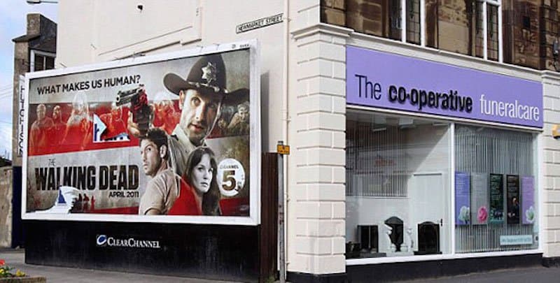
This seems to be placed in the right spot, as there’s a lot of undead on The Walking Dead, and that’s not including all of our favorite characters which have been killed off. We’re just wondering how much it’d cost for funeral care for all of the zombies.
Unfortunate Placement

The placement of these two billboards is rather crude — funny, but crude. The placement of the gun and child is what has got us — maybe they should have changed the positions of the ads?
Luscious Locks

Yanni has some rather luscious hair in this picture, and is sporting some pretty good underboob. The placement of these CDs is perfect.
Get Your What Ready?

We’re not too sure who placed the lozenge ad next to the condom section, but it’s a bit suggestive, don’t you think?
Oops Indeed
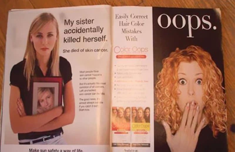
The page placement in this magazine is rather crude and careless. It appears as if she’s saying “oops” to her sister killing herself…
Cruise Discounts

YouTube has some rather intrusive advertisements, including unskippable ones which we hate watching. We should pay more attention though, maybe we’d catch something like this?
Retirement Homes

The Game Of Thrones advertisement right above Santa Monica’s residential care seems to suggest they’re not providing the care they advertise.


