20 Of The Funniest Organization Logos Of All Time
Entertainment, Funny, Illustration, Lists, Other, Shocking, WeirdWe all appreciate a good corporate logo. They can stir our deepest feelings, provide comfort before we make a purchase, and let us know exactly what we can expect from an organization. Unfortunately, as with many things, logos can go bad. In such instances, we are left to wonder who approved the logos of these organizations. We have to ask “was anyone paying attention?” Seriousness aside, a poorly chosen logo is always good for a laugh so we wondered, what are the top 20 funniest logos out there? So, without further ado, here are 20 Of The Funniest Organization Logos Of All Time.
Bureau of Health Pomotion of Taiwan
It’s pretty obvious what this looks like, we’re just wondering what it’s supposed to look like.
Encebe Corp.
This simple meat packing and transportation company clearly has no idea what their logo looks like.
Safeplace
We assume this is some kind of child care facility, one that should definitely consider a new logo.
Clinical Dental
Well, at least patients get service with a smile.
Kostelecke Uzeniny Sausage Company
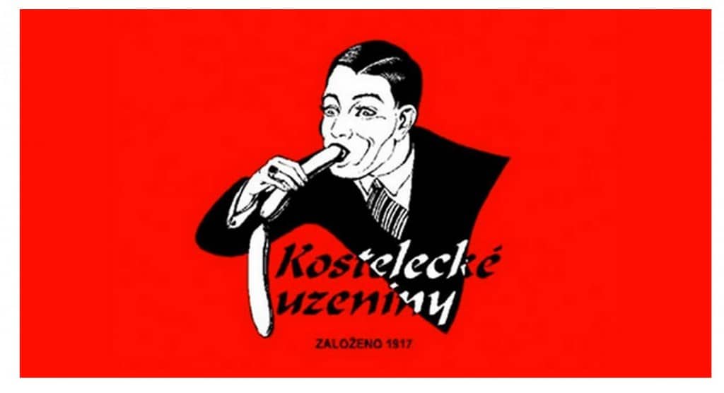
The character in this logo must really like his sausage.
HASC Center
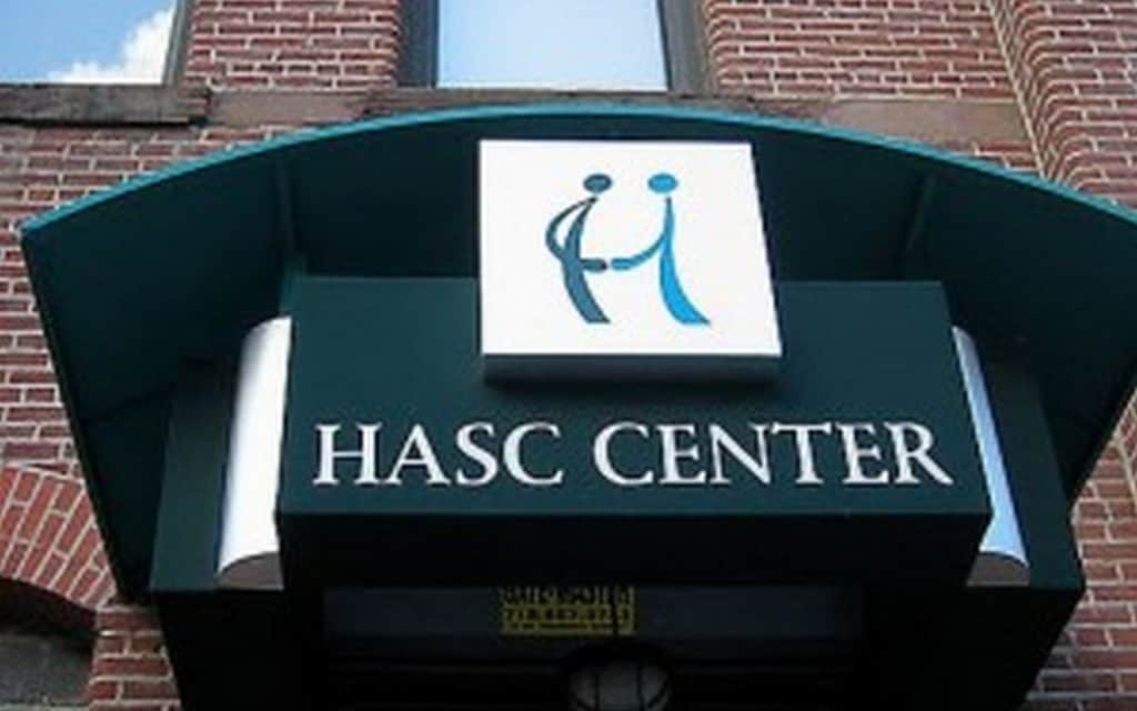
Are the characters in this logo shaking hands or something else?
Satellite Dish Installation
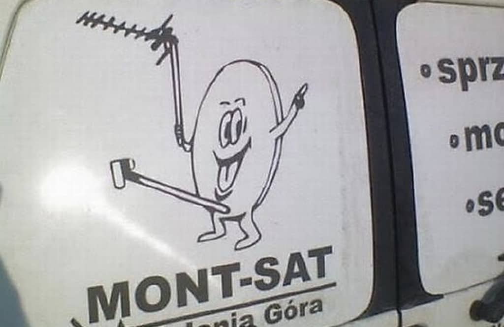
We just don’t know how this logo found its way to the side of satellite dish installation vans and, yet, here we are.
Kudawara Pharamacy
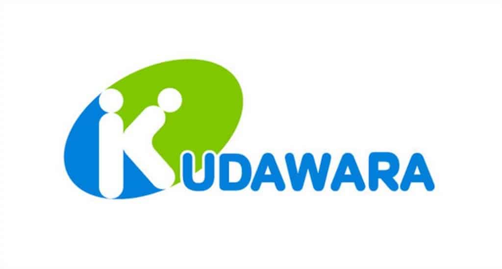
We’re pretty sure that this company was going for a “K” with their logo, meaning the first letter of their corporate name. Unfortunately it looks like something else all together.
Arlington Pediatric Center
This is meant to look like an adult putting their arm around a child, but copy-editors really should have taken a closer look at this one.
Catholic Church’s Archdiocesan Youth Commission
Given the scandals experienced by the Catholic Church in recent years, this logo for the Catholic Youth Commission really needs to be changed.
Deccan Engineering
Whoever founded Deccan Engineering clearly didn’t think enough about their logo.
Brazilian Institute for Oriental Studies
We literally have no idea how this logo for the Brazilian Institute for Oriental Studies passed committee.
Locum Paper Products
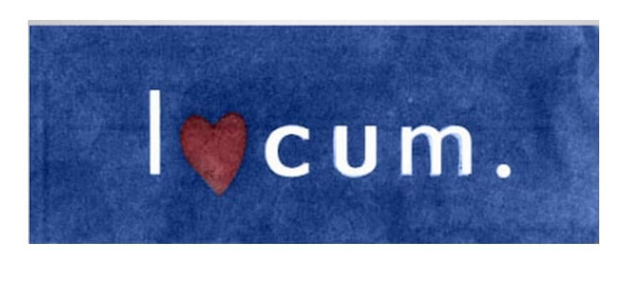
We know that Locum is trying to say that by buying their product, you’ll love their product. Unfortunately to the discerning eye this reads as something else all together.
Junior Jazz Advertisement
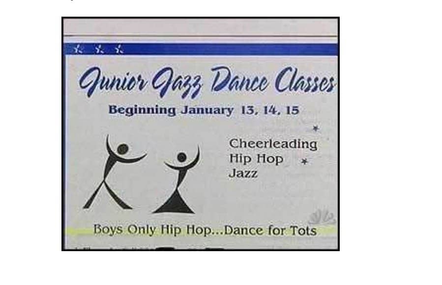
We don’t know what “Boys Only Hip Hop…Dance for Tots” means, but it can’t be good. With regards to two people who are supposed to be dancing, their posture looks a lot like a female body.
Computer Doctors
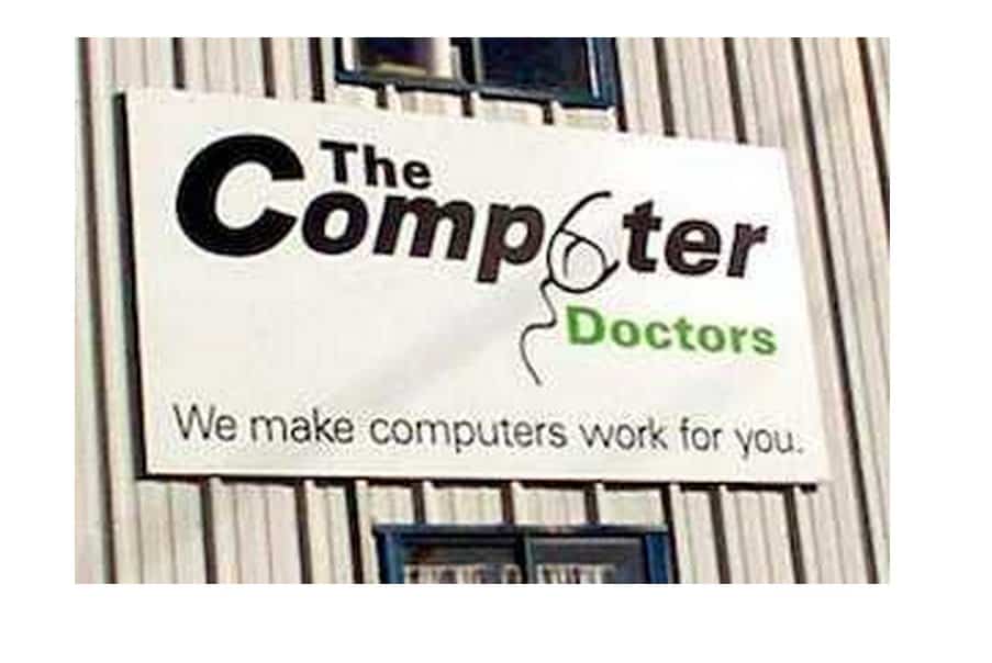
This is clearly supposed to be a mouse leading to a computer on the logo, unfortunately is also looks like someone that needs to pull up their pants.
Megaflicks
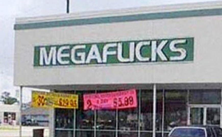
We love going with our significant other, renting a flick, and heading home to enjoy the movie. Unfortunately, upon reading this sign, we recommend that they change their font choice.
Kids Exchange
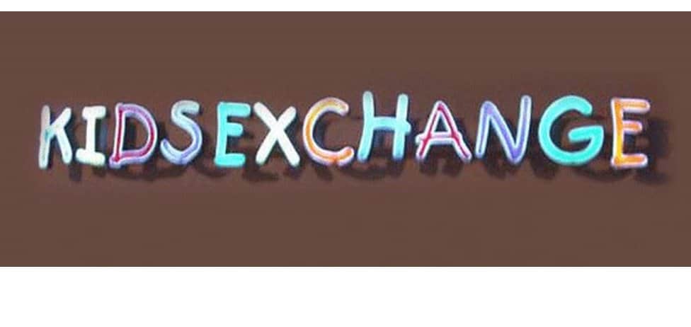
We’re not sure what a “Kids Exchange” is, all we know is what its sign looks like it says…
Currency Exchange
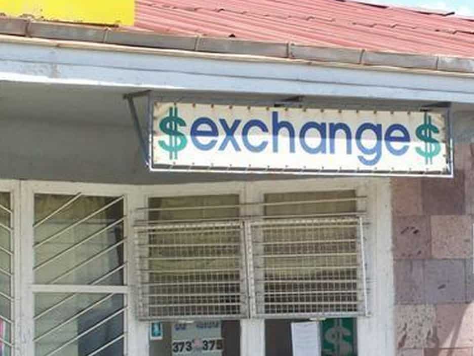
Maybe they should think about the spacing on their logos before putting it in front of their shop for the world to see.
Office of Government Commerce (OGC)
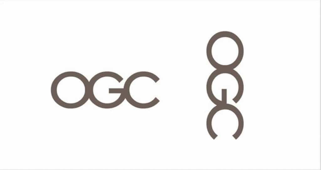
This is a pretty simple logo, but it looks strangely like something else when it’s turned on its side.
Fully Erect Tents
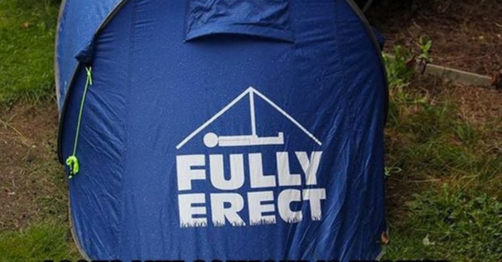
While the man laying down looks like he’s holding one of his appendages, we’re not too sure if this was intentional, given the company name.

